


Back to top
The District Burlington
Environmental Graphics
Location
Burlington, Massachusetts
Client
National Development
Designers
Richard Poulin
Kathryn Lewis
Kathryn Lewis
Publications and Recognitions
Communication Arts
Dexigner
Graphic Design USA
Society for Experiential Graphic Design (SEGD)
Previous
Next
© Poulin + Morris Inc. All rights reserved 2017.


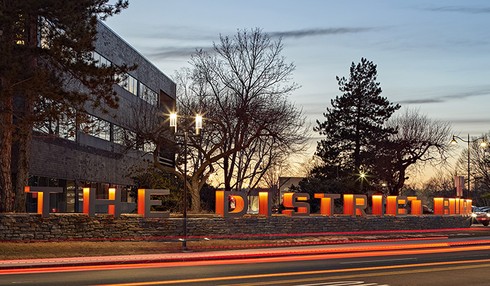
and part of the Route 128 high tech corridor. The development, previously called the New England Executive Park, was built in the 1960s through the 1980s. While the location in the Boston area’s technology hub was highly desirable, the facilities were showing their age and no longer made sense for modern workplaces. National Development, the new owner of The District Burlington, aimed to reposition the complex by adding shopping, dining, and lifestyle options within a walking distance for their tenants. The result is a modern office park that brings urban amenities and an emphasis on employee wellbeing to the suburbs of Boston.
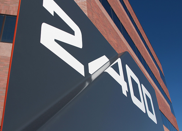
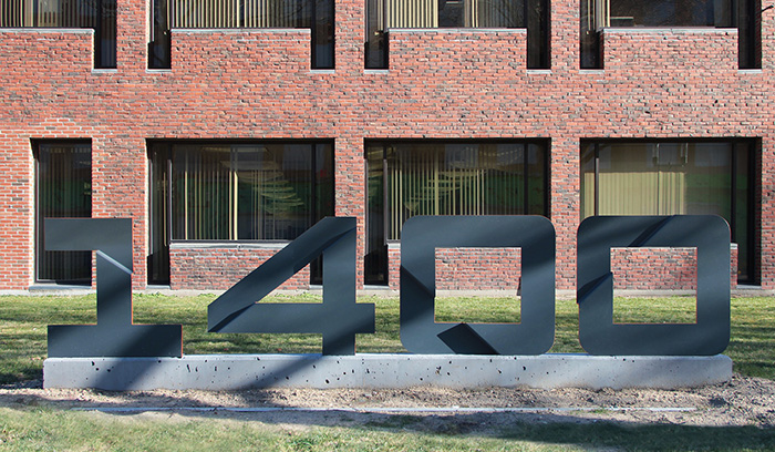
The challenge for the design team at Poulin + Morris was to create a comprehensive approach to presenting information throughout the complex that also reflects The District Burlington’s distinction as a vibrant enclave suited to innovative, 21st century businesses. The overall exterior program is characterized by dimensionality; nothing is flat or conventional. As you approach the complex gateway, the name The District Burlington appears in three-foot-high letterforms that appear integrated with a stone wall. Each individual letterform is comprised of multiple aluminum fins with interior LED illumination that produces a distinct orange glow at night. As you navigate throughout the development, building identification signs, building address identification signs, commercial and retail tenant directories, and street signs are all made distinctive by a fold in the metal, often cutting through numbers or symbols. These folds are a three-dimensional interpretation of the distinctive diagonal slash evident in The District Burlington’s logotype. That motif, along with edging in orange that recalls the project’s main identification sign, is found throughout the entire sign program. Overall, the complete program contributes to The District Burlington’s goal of creating a vibrant, forward-looking workspace that appeals to the most modern companies